Gotta love this headline: Ford Has Loss of $1.4 Billion in Quarter, but Beats Forecast. How bad must that forecast have been??
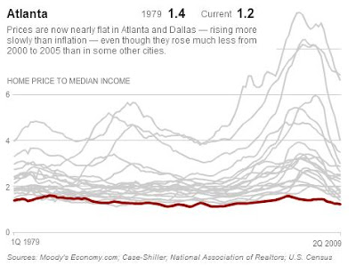
In other economic news, I really liked the charts of median housing prices vs. income in various cities that accompanied an article in the NY Times a few days ago. If you look at it this way, quite a few cities never really had a housing bubble at all-- there was just the kind of price increase you'd expect as incomes grew. Example, Atlanta:
Then there are cities that had extremely pronounced skews in housing cost as a percentage of income. San Francisco and New York have always been expensive, and are still priced higher than historical averages:
It's interesting to note that in 1979, New York was actually a more affordable place to live than San Francisco in these terms:
Los Angeles had one of the biggest spikes of all, but prices have fallen steeply in relation to income:
What I'd really like to see is a breakout of the two factors in each of these graphs-- the actual median home prices over time and the actual median incomes over time. I think part of the story here is that median incomes are pretty flat, as most people have gotten pretty much no benefit at all from the economic growth we've had over the past decade. In cities with the highest degrees of income inequality, like New York, we see the biggest housing bubbles, as those at the highest end of the income spectrum, who have increased their wealth the most in both absolute and relative terms, help drive up prices for everyone else. That's my theory anyway... either way, I do love data and charts like this. I should have become an economist!
Friday, April 24, 2009
A Couple Tidbits of Recent News
Posted at 10:28 AM
Labels:
economy,
news,
real estate
![]()
Subscribe to:
Post Comments (Atom)


No comments:
Post a Comment